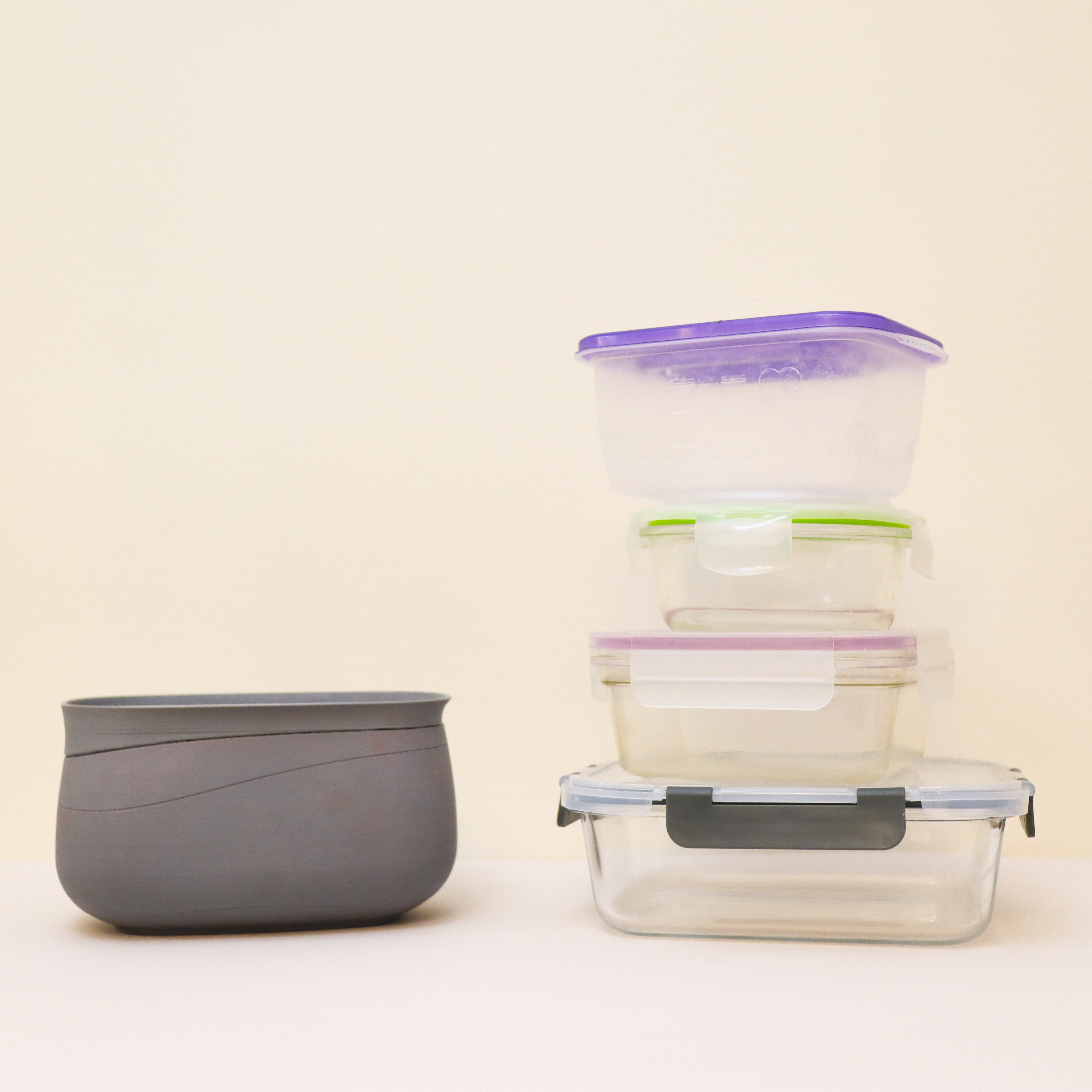
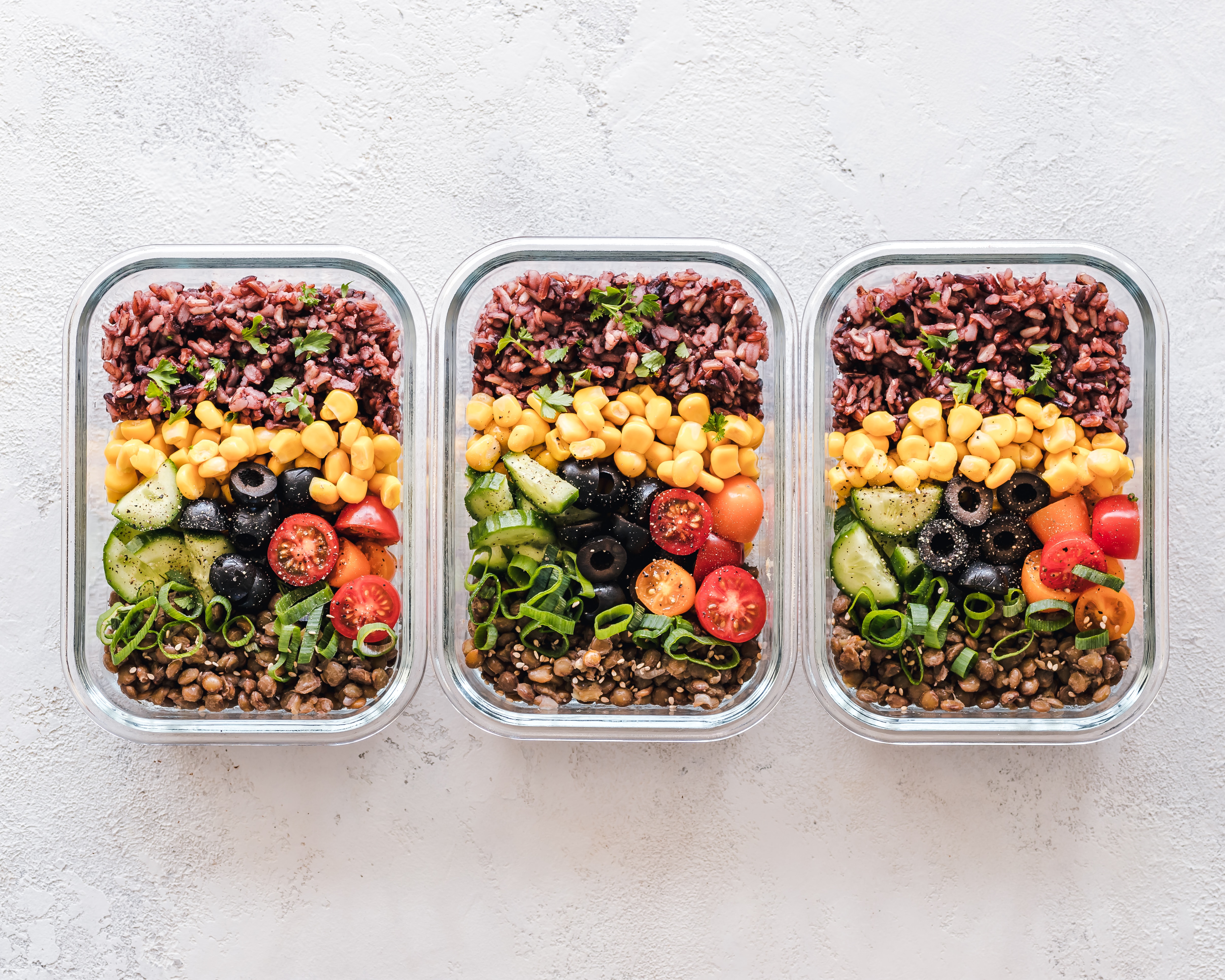
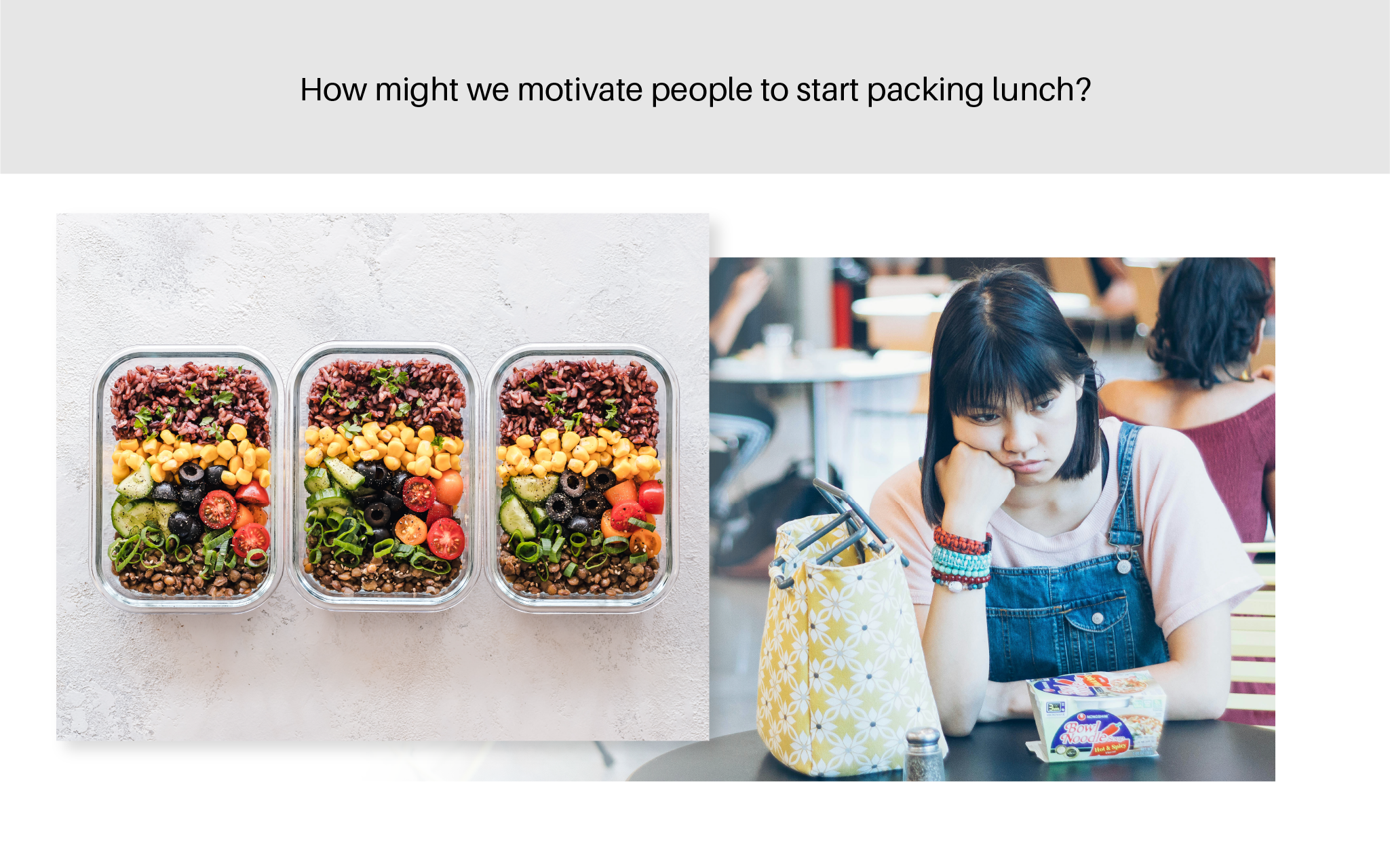
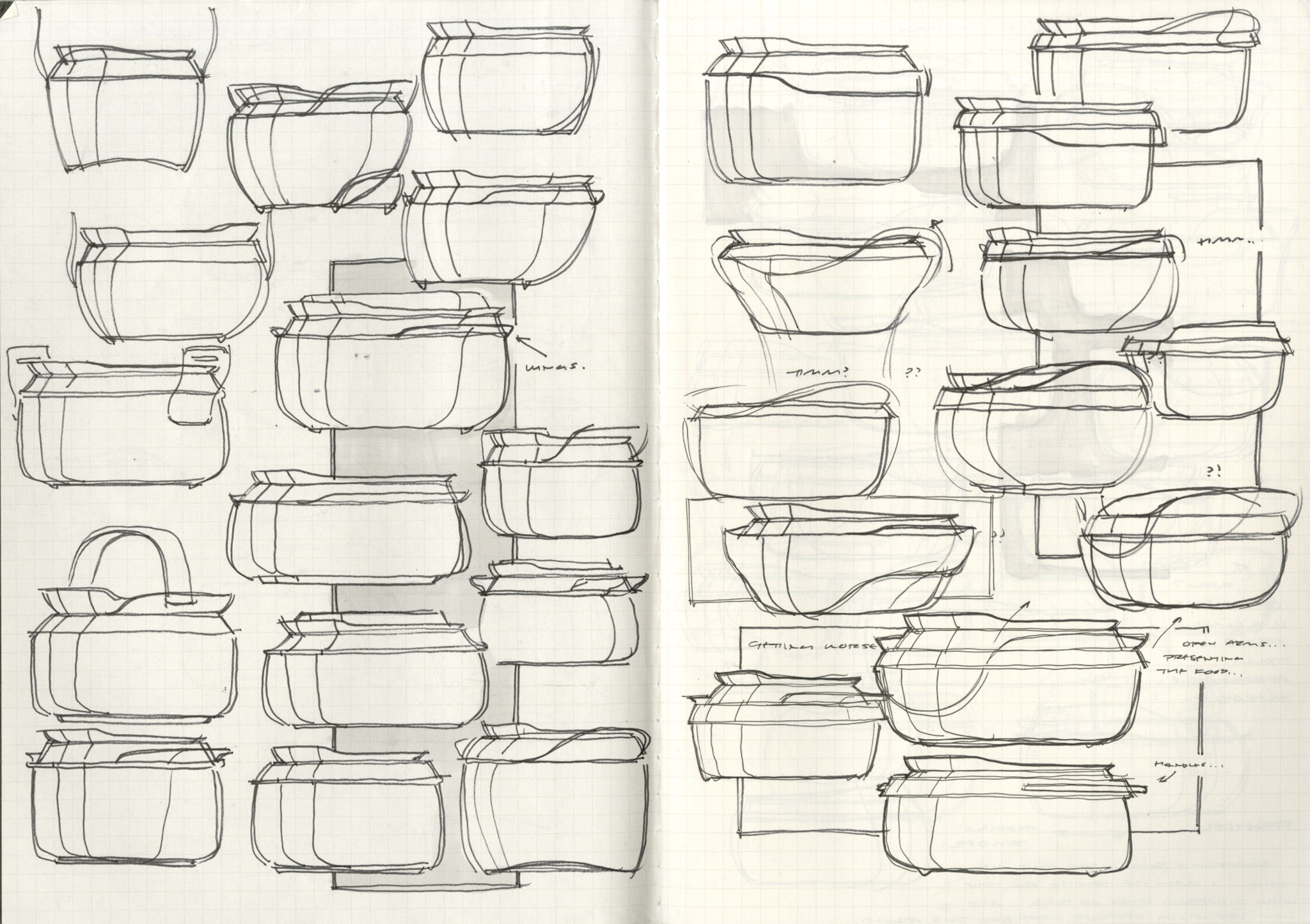
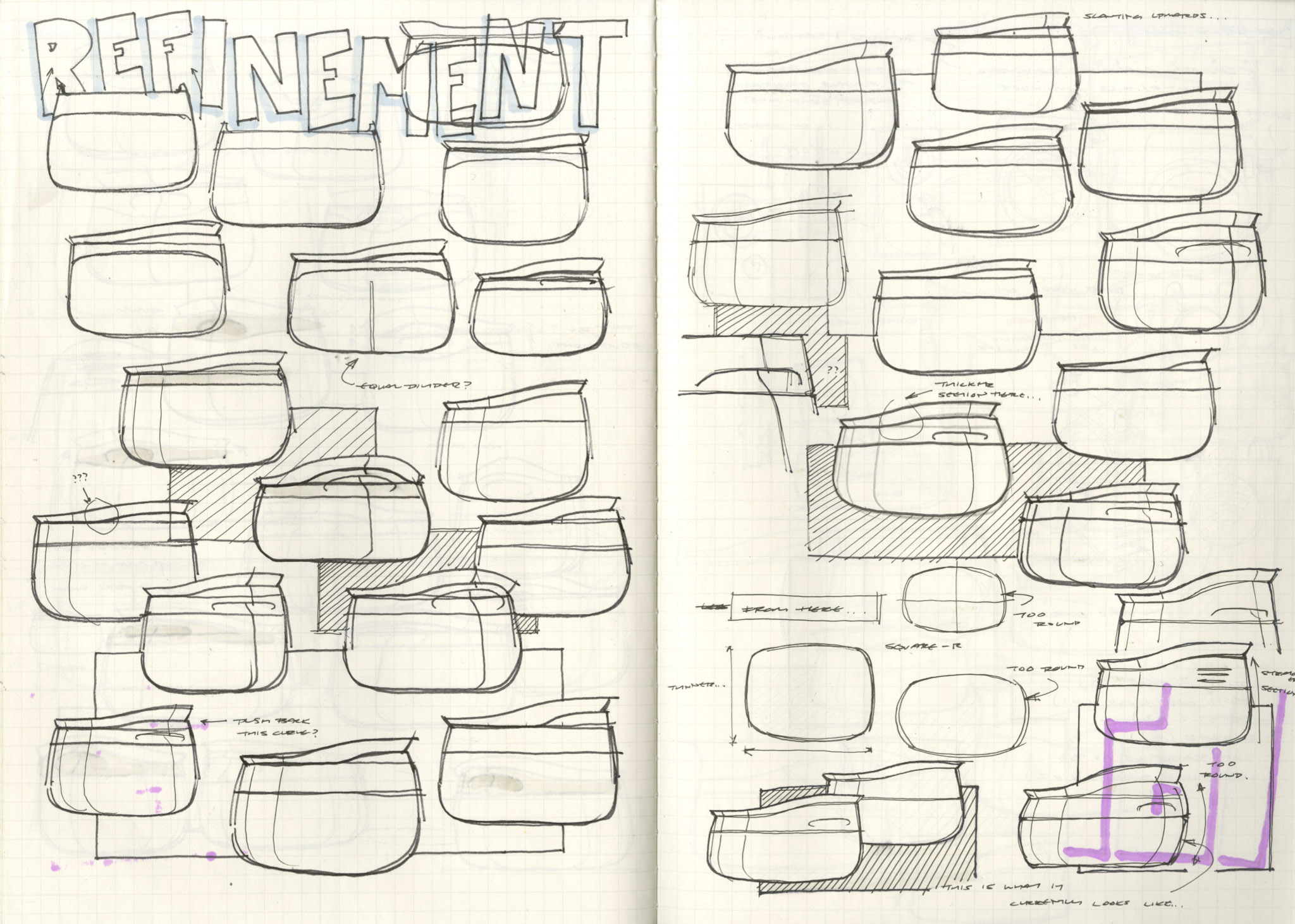
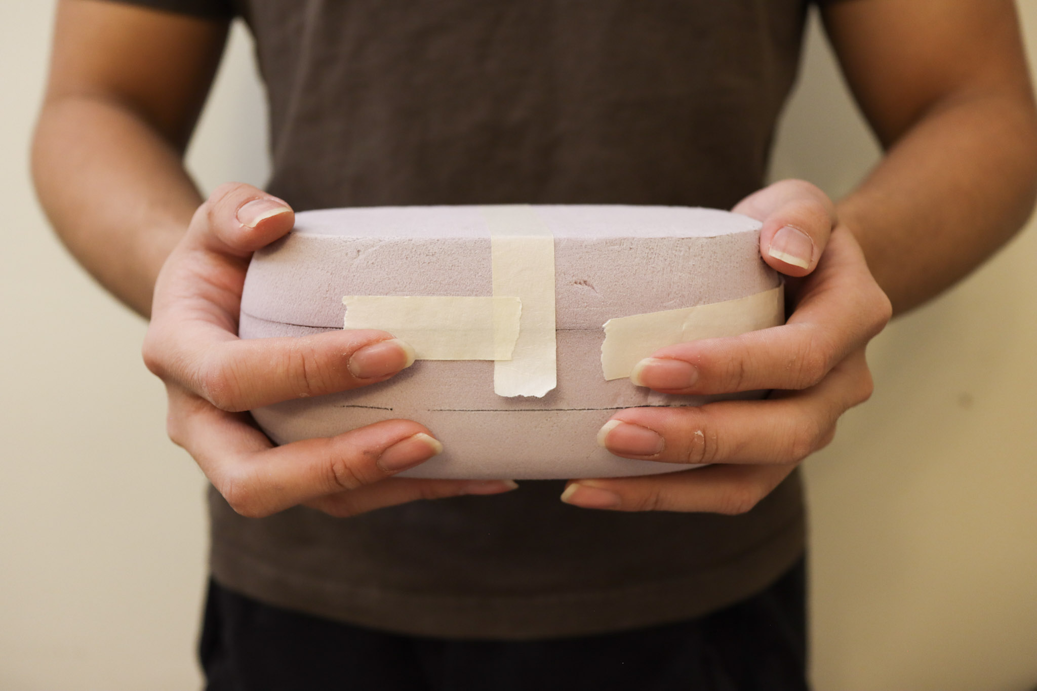
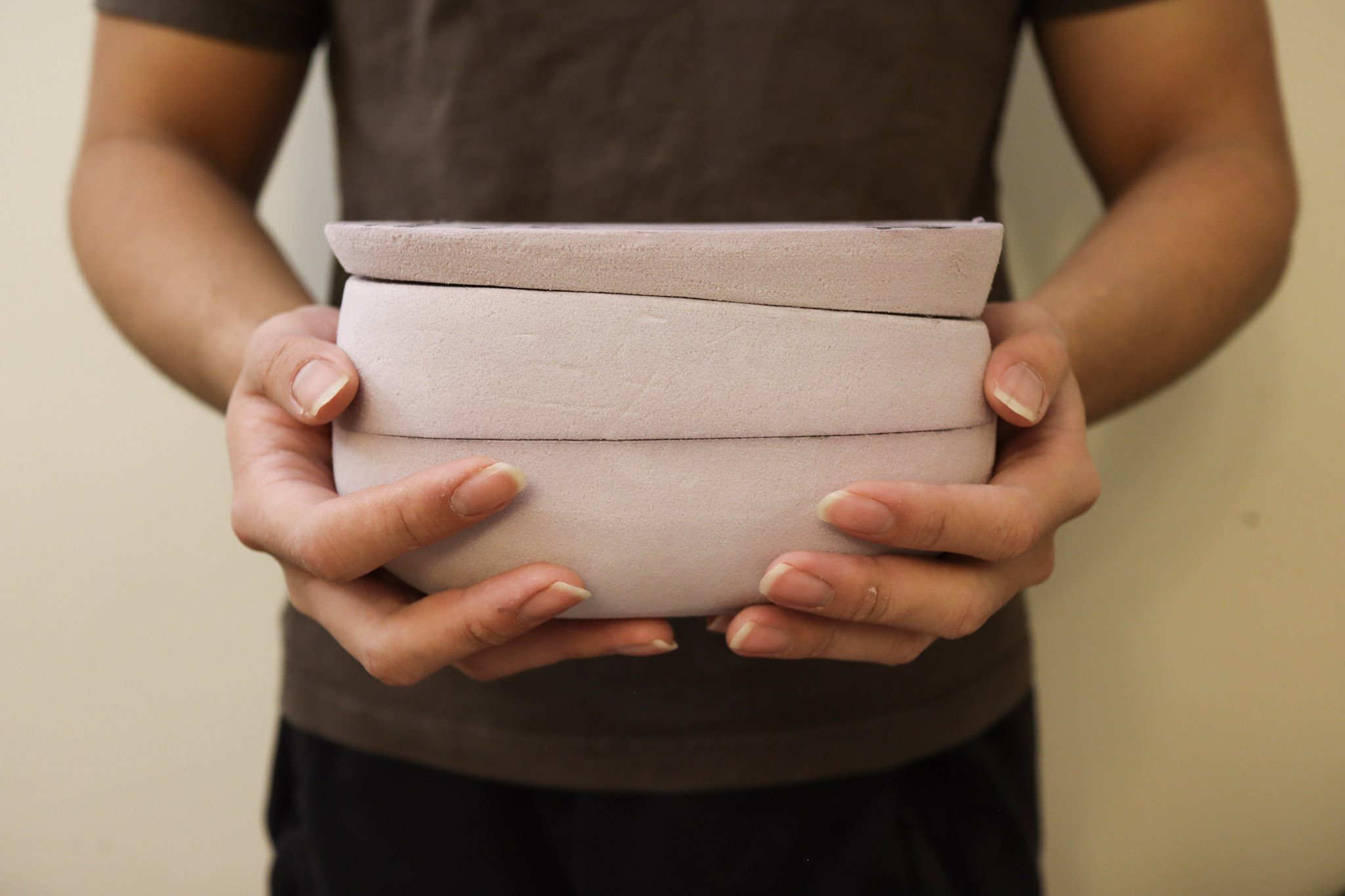
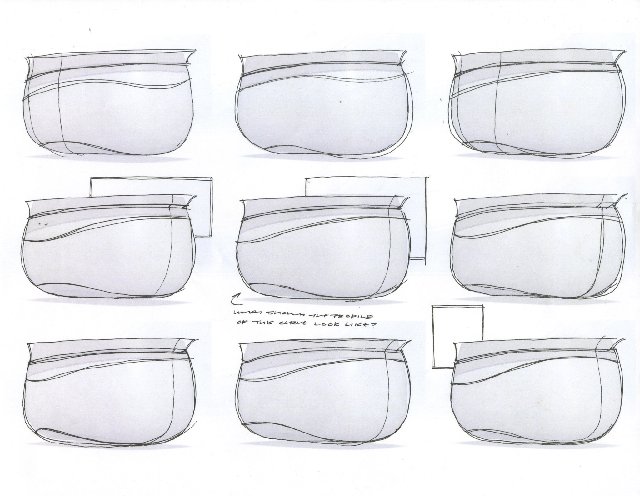
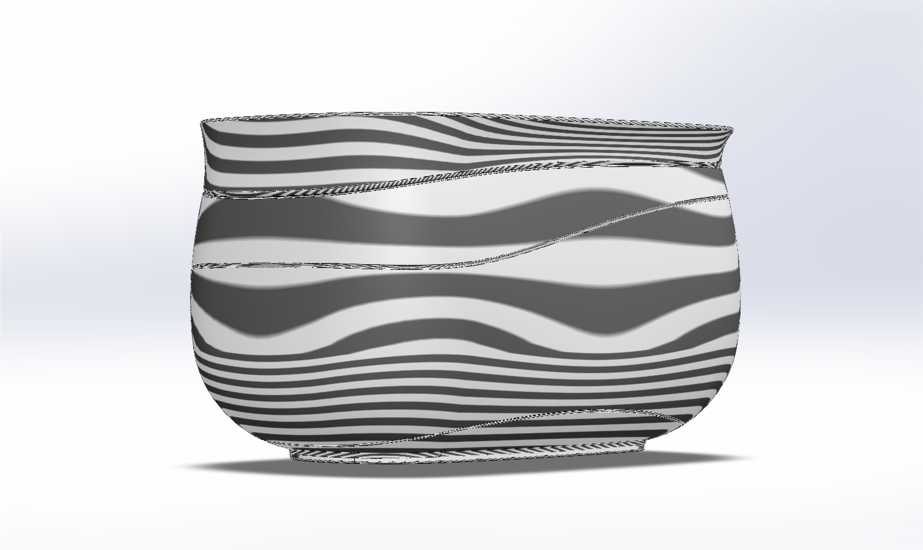
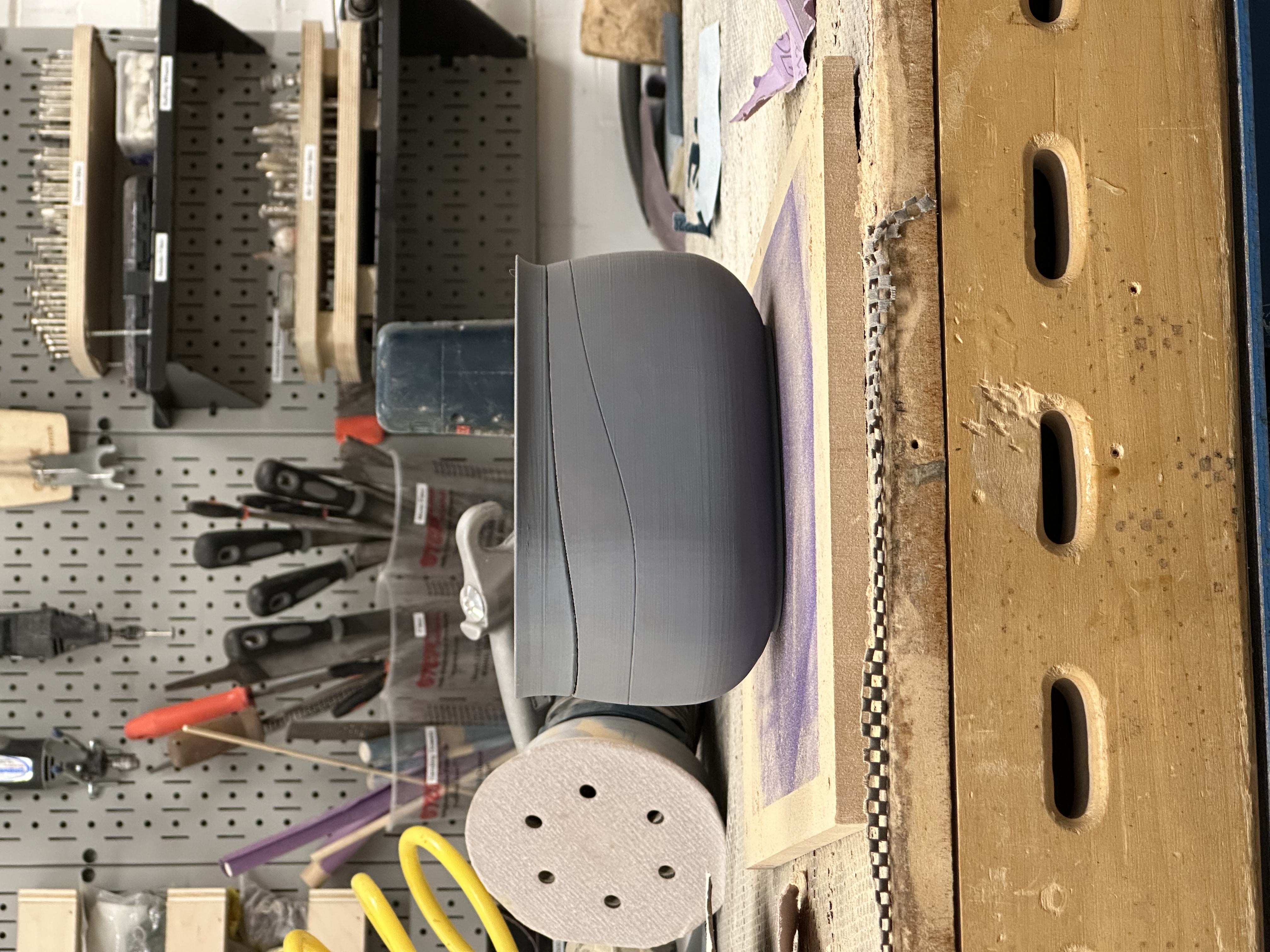
How can we modernize the lunchbox to serve modern consumers & modern workplace eating habits?
[Description]
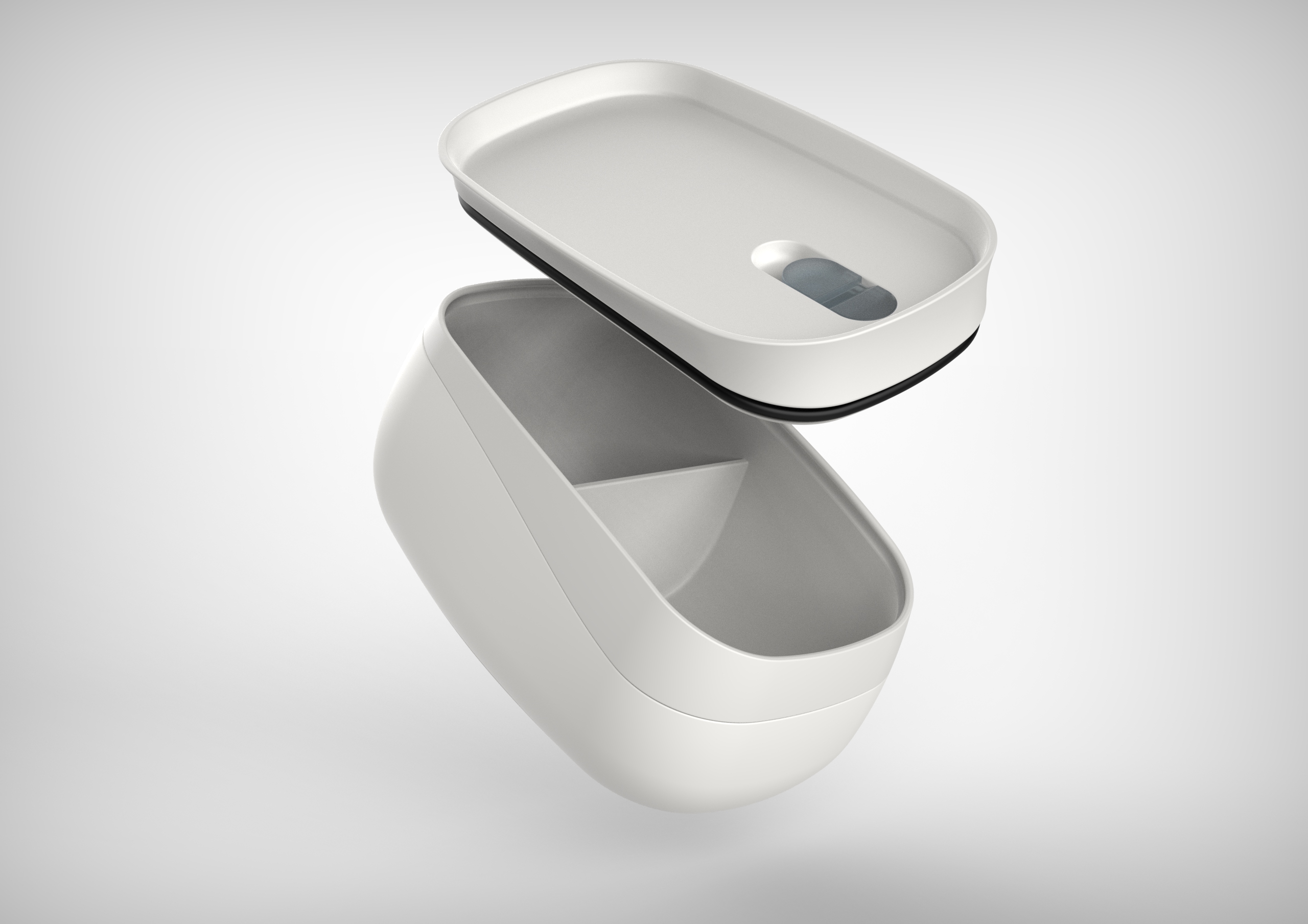
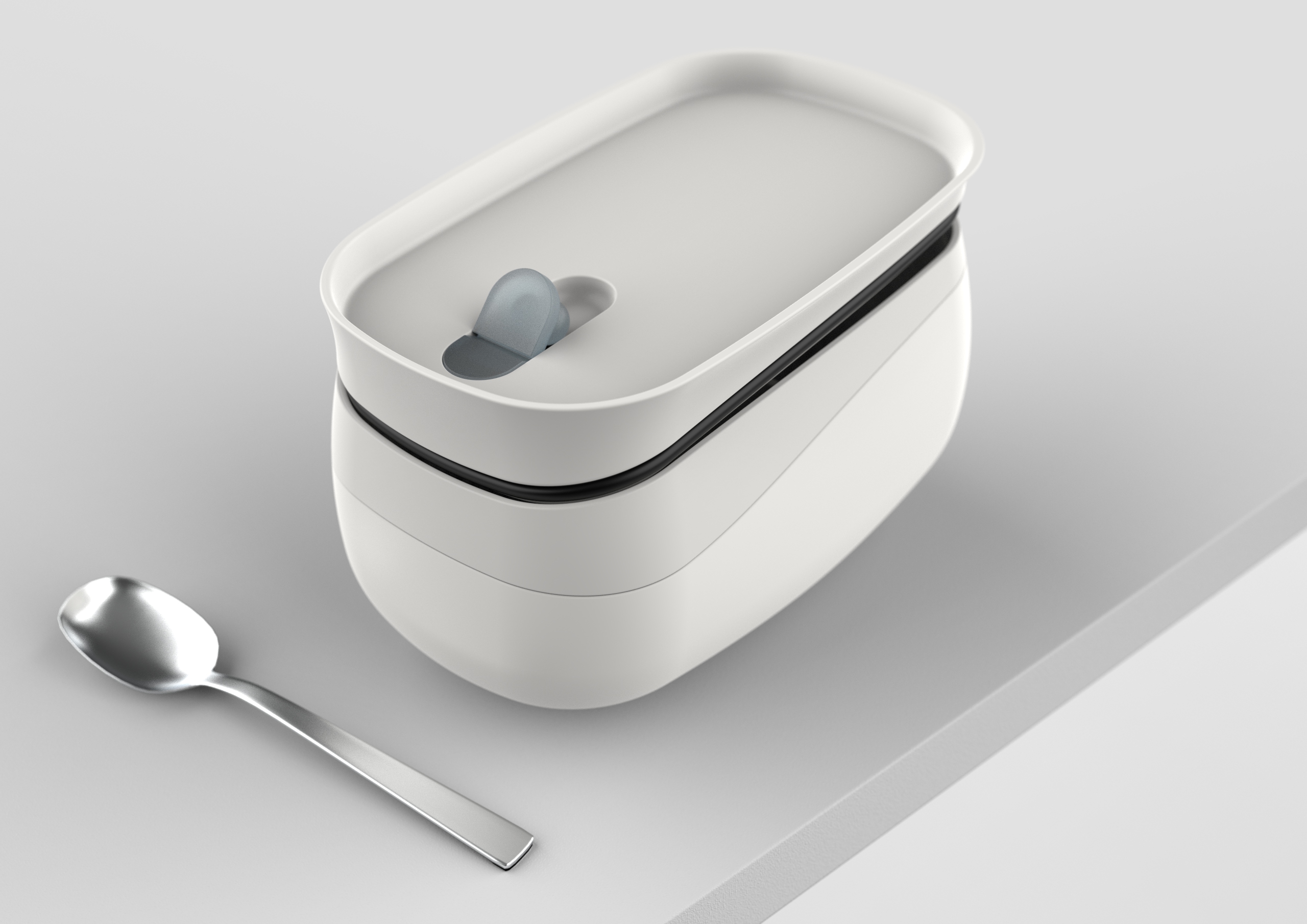
A lunchbox targeted at young working professionals looking to pack lunch to work more often, instead of eating out.
[Tools & Processes]
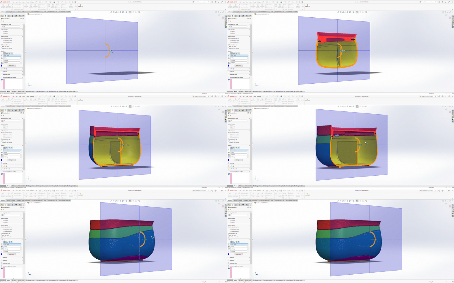
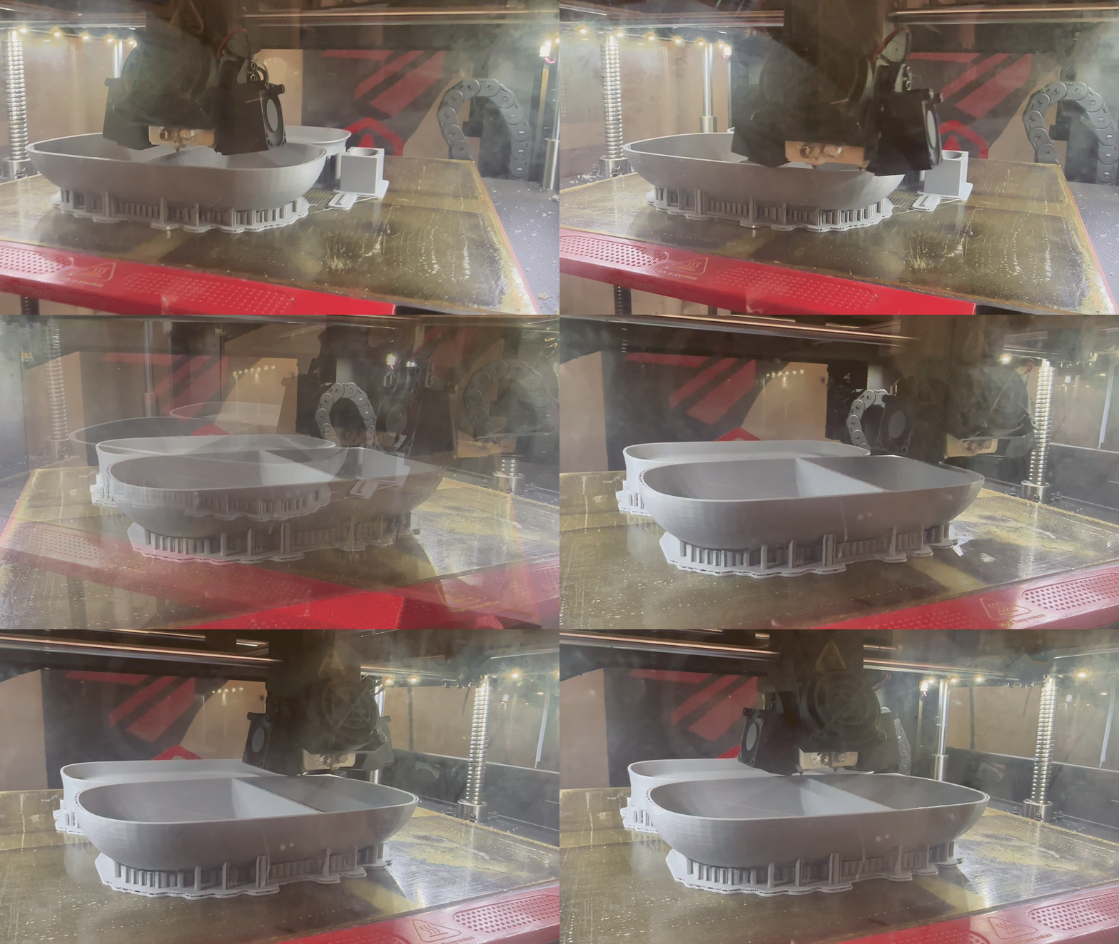
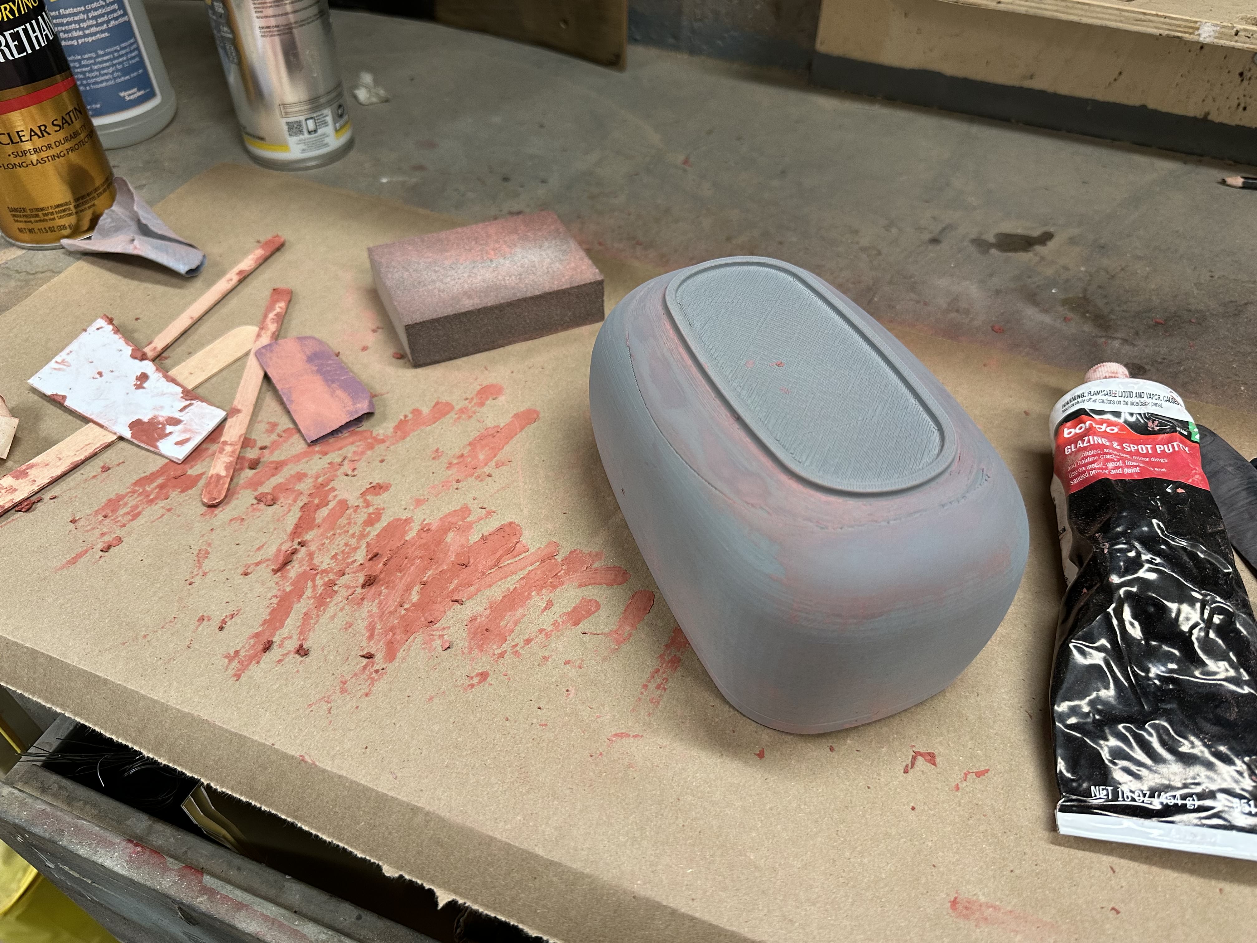
Research via surveys, interviews & user observations. Prototyping via sketching, foam modeling, CAD & 3D printing.
[Duration]
4 weeks.
[Project Introduction]
Why do we pack lunch to work?
Hundreds of years ago, eating lunch was a domestic activity. Later, throughout the industrial revolution, eating lunch at designated lunch breaks became the norm. Since people no longer had the time to go home and eat, many people started to pack their lunches from home instead - a habit which many of us practice today.
With changing modes of work, the rise of health-consciousness & financial sensitivity in the media, an increase in demand for individualization in outdated, homogenized workplaces…how do we navigate the factors that affect the way we eat during our lunch breaks, and how can we modernize the lunchbox to address these changes?

[Initial Research]
What is eating lunch at work actually like?
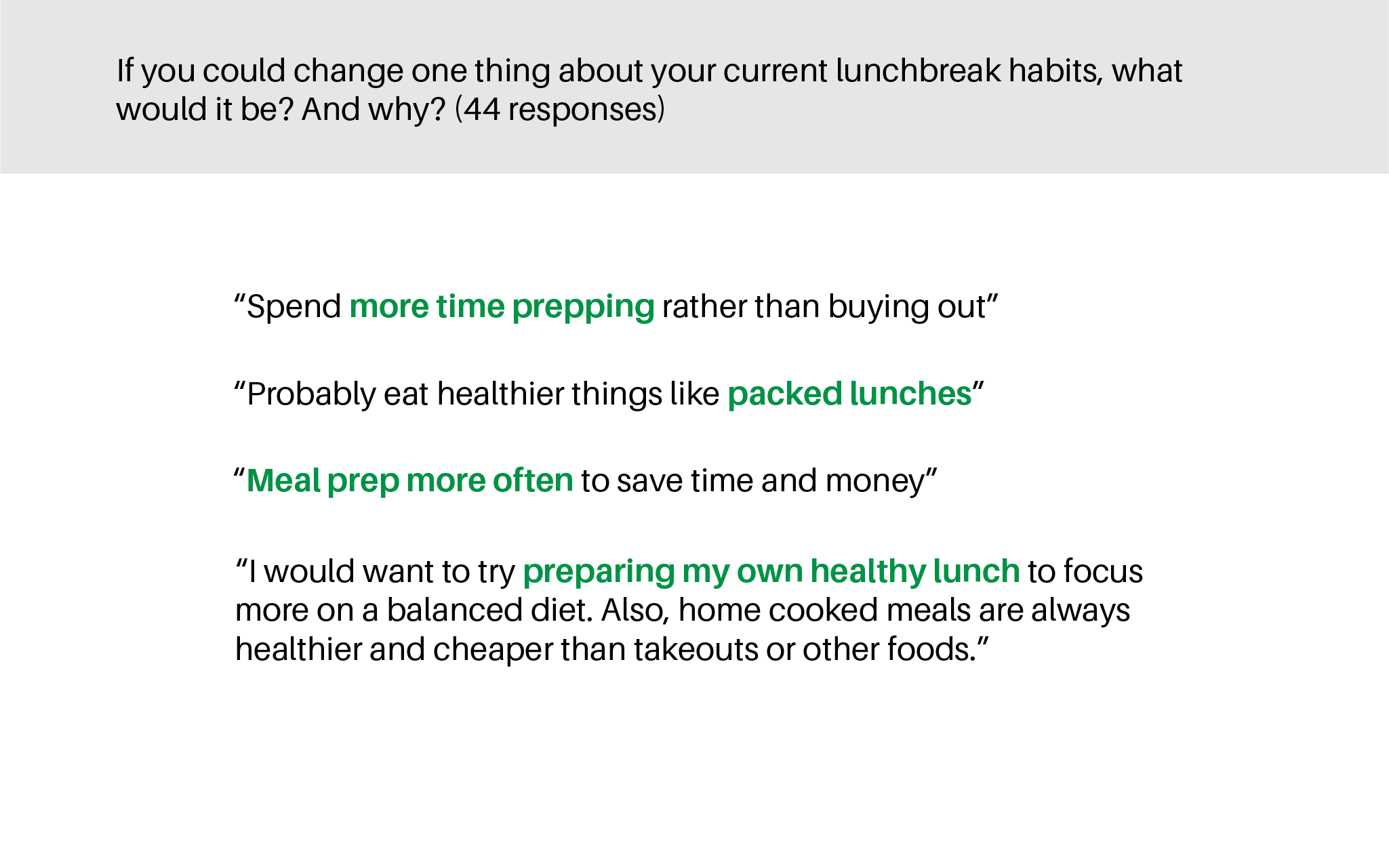
To start, I sent out a survey to college students & young professionals to learn about their current lunch break habits & conditions. Though I learned much, one unexpected finding caught my attention.
Of all participants, half pack their lunch, and half buy takeout/eat in a restaurant. Of those who don’t currently pack their lunch, many wanted to start doing so, to eat healthier & save money.
This led me to ask a simple but complex question:

[Further Research]
If we know packing lunch is good for us,
why don't we do it more often?
Seeing this as an opportunity to design a solution, I conducted interviews & observations with people who pack their lunch, and people who used to pack their lunch, but stopped. I hoped to gather their solutions & pain points in order to develop a concept. In particular, a way to motivate people to pack their lunch more often.

[Research Conclusion]
A realization...
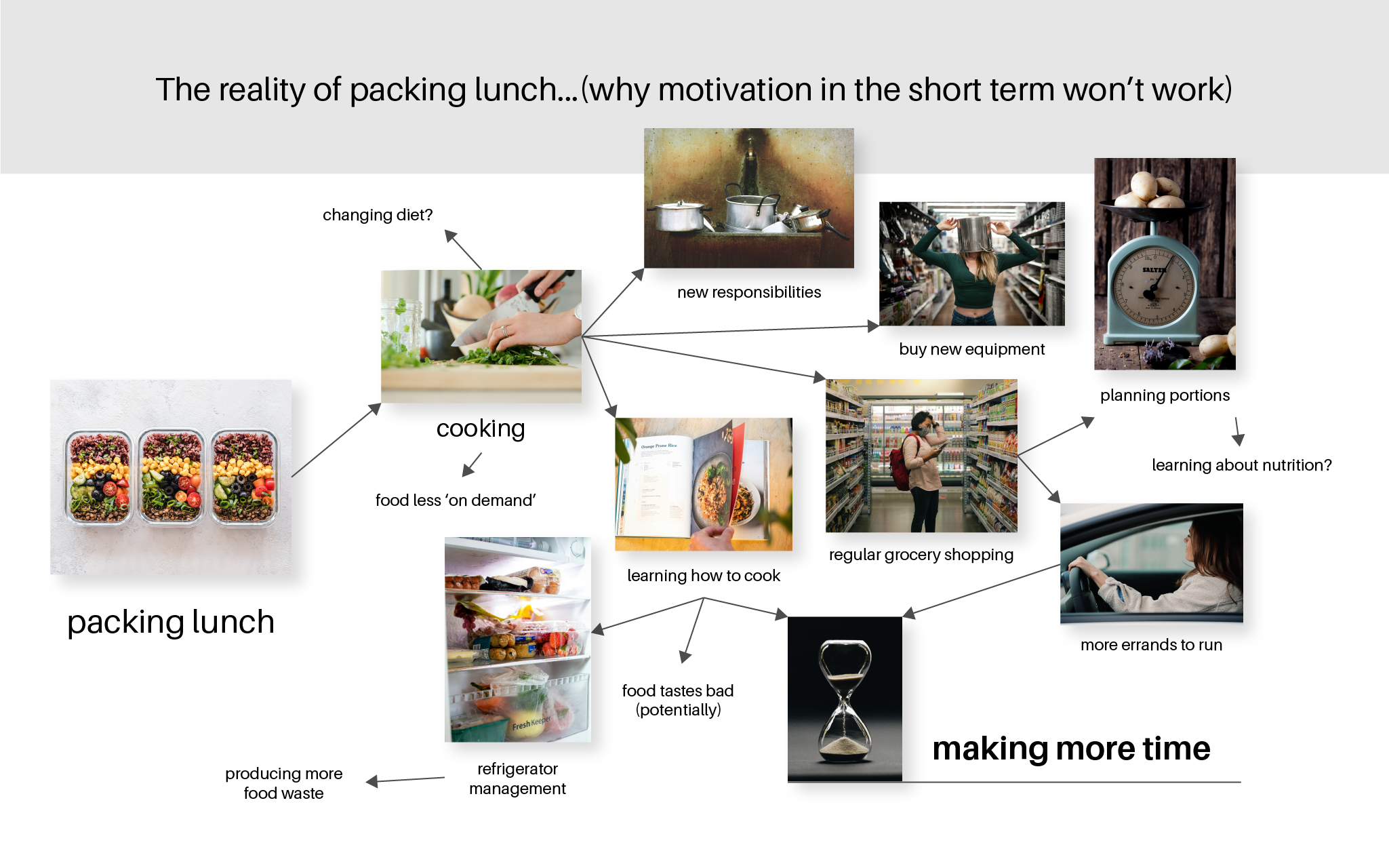
Rather than learning about how I could develop a solution, I learned that packing lunch is much more complex than it seems. Though we know the benefits of packing lunch, to actually feel its benefits, we have to habitualize it, which is a huge lifestyle change.
Instead of thinking about how I might ‘motivate’ someone to pack their lunch in the short term, I focused on how I can make packing lunch more enjoyable in the long term.

[Concept Development]
Going back to the research...
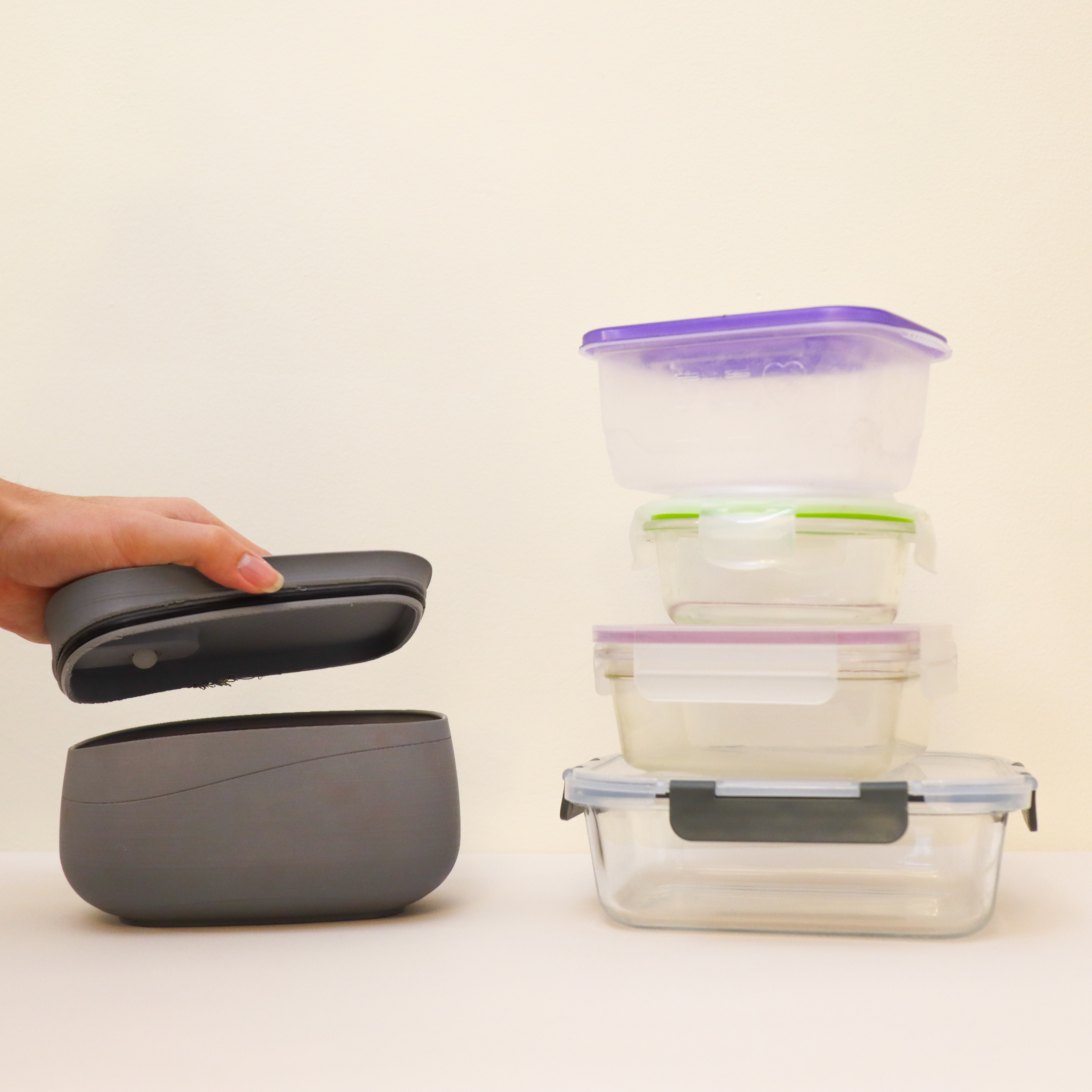
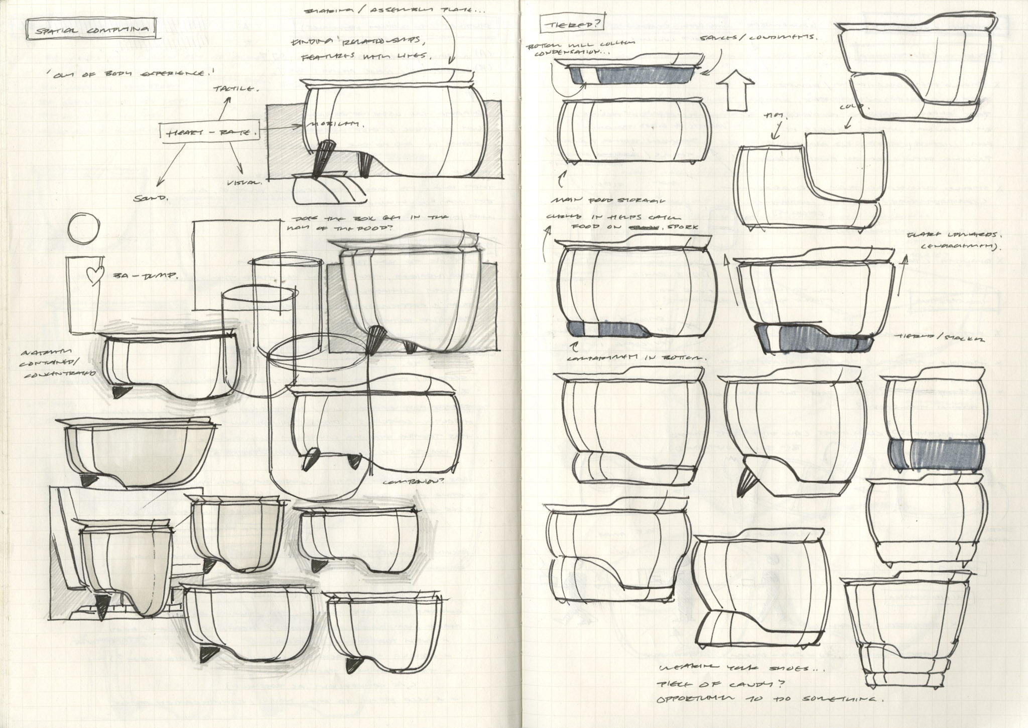
I set my sights on designing a lunchbox for people who want to start packing lunch more often, one that they can carry for the rest of their journey.
I went back into my research to identify every point at which the user would interact with the lunchbox. From there, I focused on key touchpoints and pain points, and thought about how these small interactions influence the user’s experience with the lunchbox, and by extension, their experience packing lunch.

[Concept Development]
Setting design goals
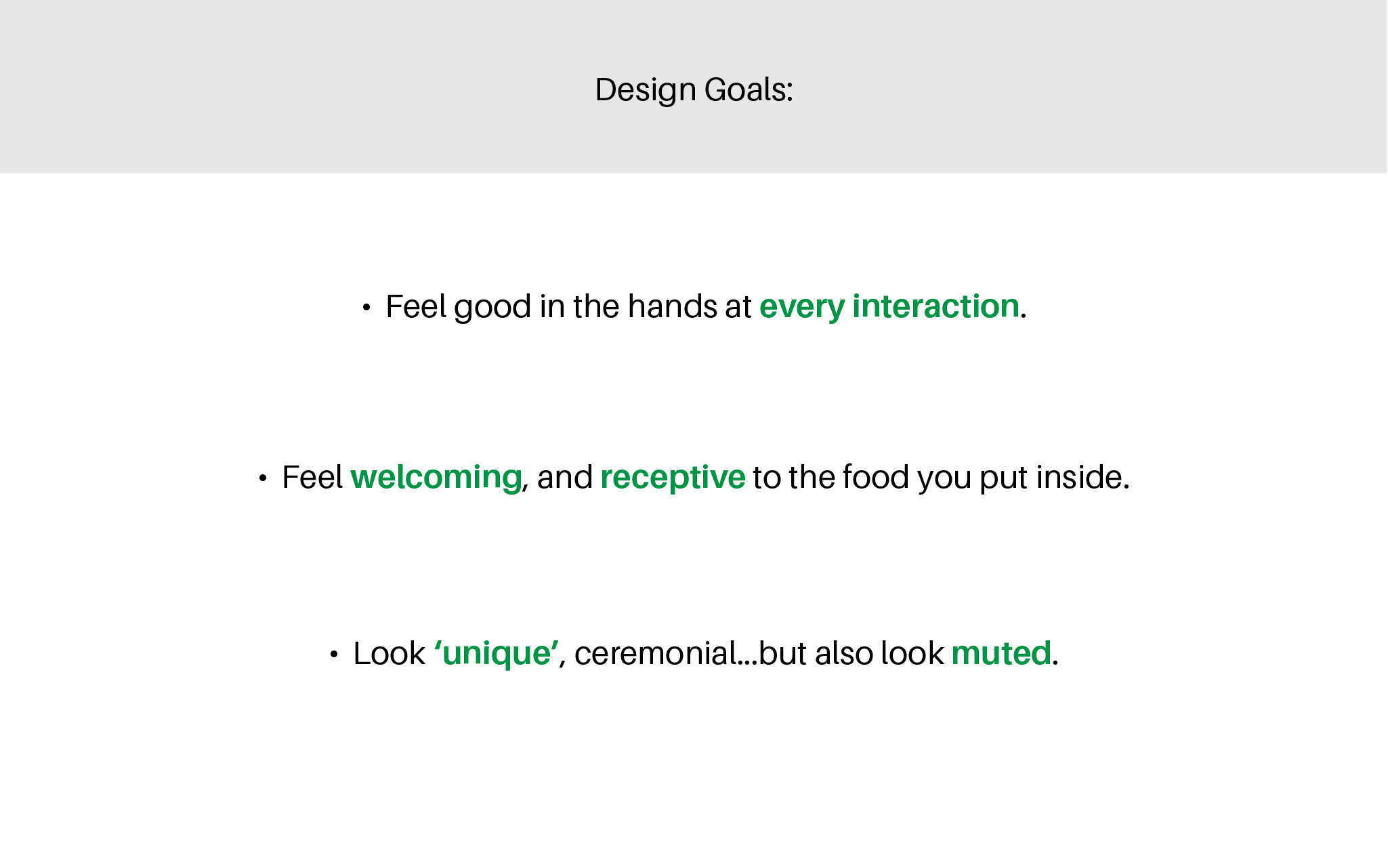
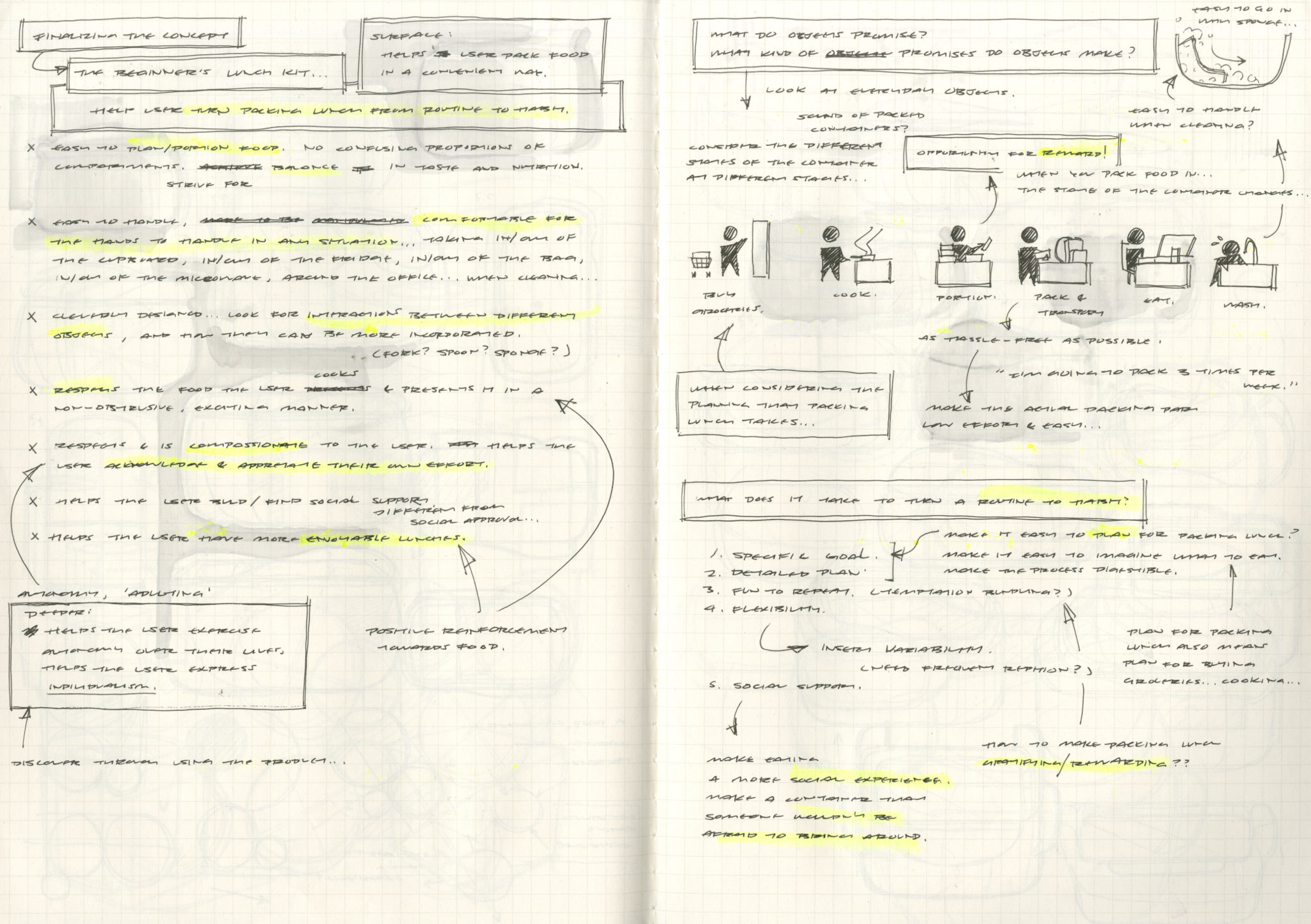
After some thought, I set some design goals, which I think will help someone nurture more positive feelings towards packing lunch, overtime.
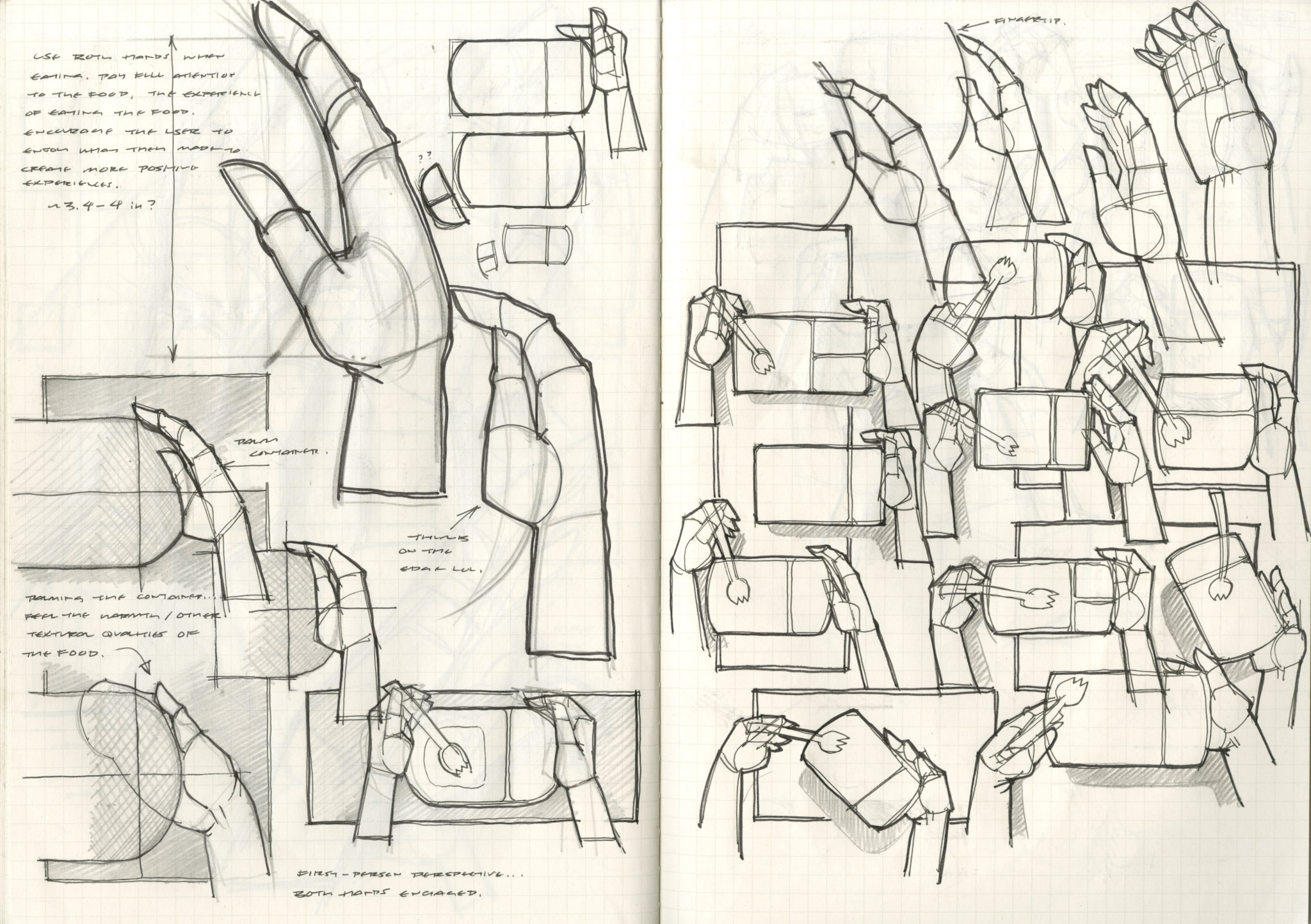
1. Feel good in the hands at every interaction. Transporting it, eating out of it, cleaning it…I want to make it easier for someone to carry this lunchbox in their hands, so that they can eat away from their usual desks.
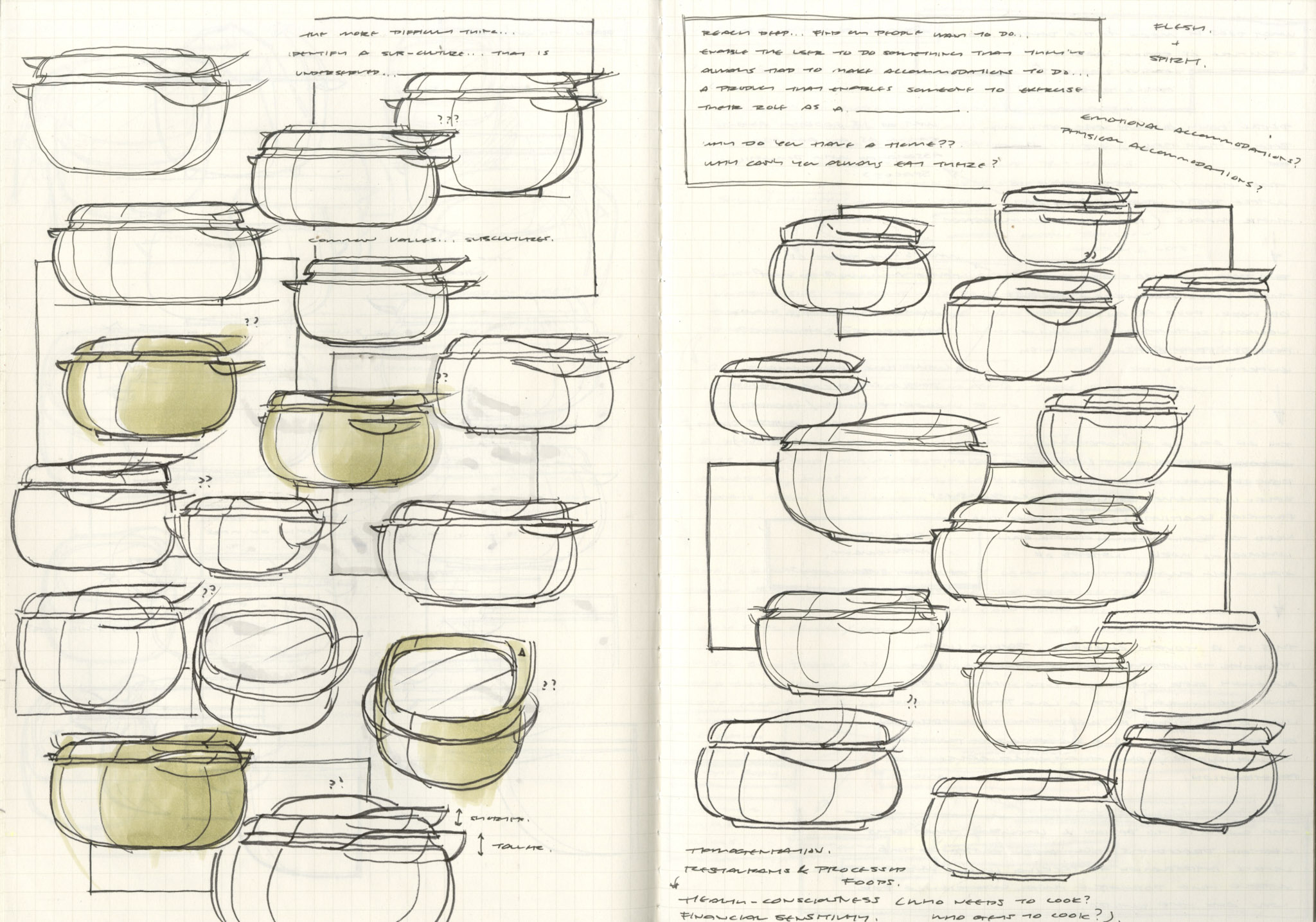
2. Feel welcoming. Packing lunch often means cooking your own food, and I want people to feel proud of the food they made. The lunchbox should feel receptive and complement the food you put inside.
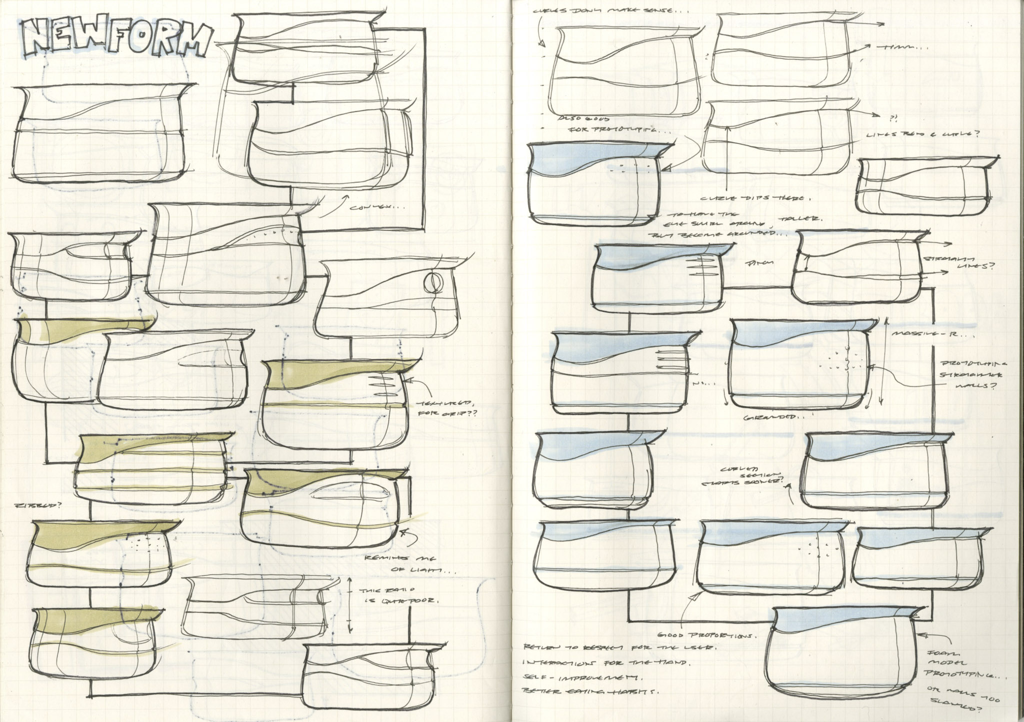
3. Look ‘unique’. Like any other habit or routine, packing lunch isn’t glamorous. Despite this, I want the lunchbox to feel ‘ceremonial’ in a way, so that it celebrates your efforts when you’ve made the time to pack your lunch.
3.5. But also look muted…the people purchasing this lunchbox aren’t just looking for a tool to carry the lunch, but a tool to help them gain some autonomy over their lives. Packing lunch is just one way of mastering our health, finance, and time. In honor of that, I think the lunchbox should feel like a blank canvas, because it’s the user’s own efforts that will help them succeed, not the lunchbox itself.
